
Pescuit la Feeder
Rebranding
2018
A new mark for
a fishing retailer.
A visual identity update for Pescuit la Feeder, with a redesigned fish symbol, online-store layouts and promotional graphics.
- Project
- Visual rebranding
- Year
- 2018
- Scope
- Logo redesign, colour system, online-store layouts & promotional design
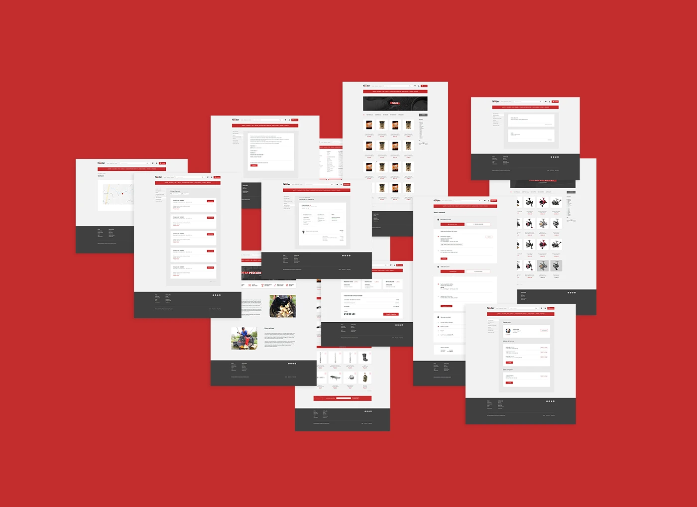
Project context
Pescuit la Feeder was using a detailed illustration as a logo, without an established visual identity. It was difficult to reproduce clearly at small sizes, while the lettering and text contrast created further legibility problems. The project replaced this with a simpler mark and a consistent system for the store and its promotional materials.
The redesigned mark
A simpler fish symbol replaces the detailed illustration. It works within the wordmark or on its own, with positive and reversed versions for different backgrounds. These variations give the identity a practical starting point for small digital placements and larger printed applications.





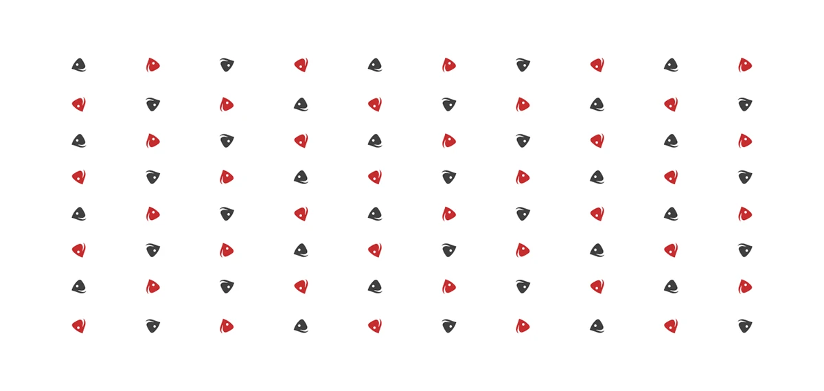
Colour and pattern
White, dark grey and red form the core palette. A repeating pattern uses the fish symbol as a graphic element beyond the name.

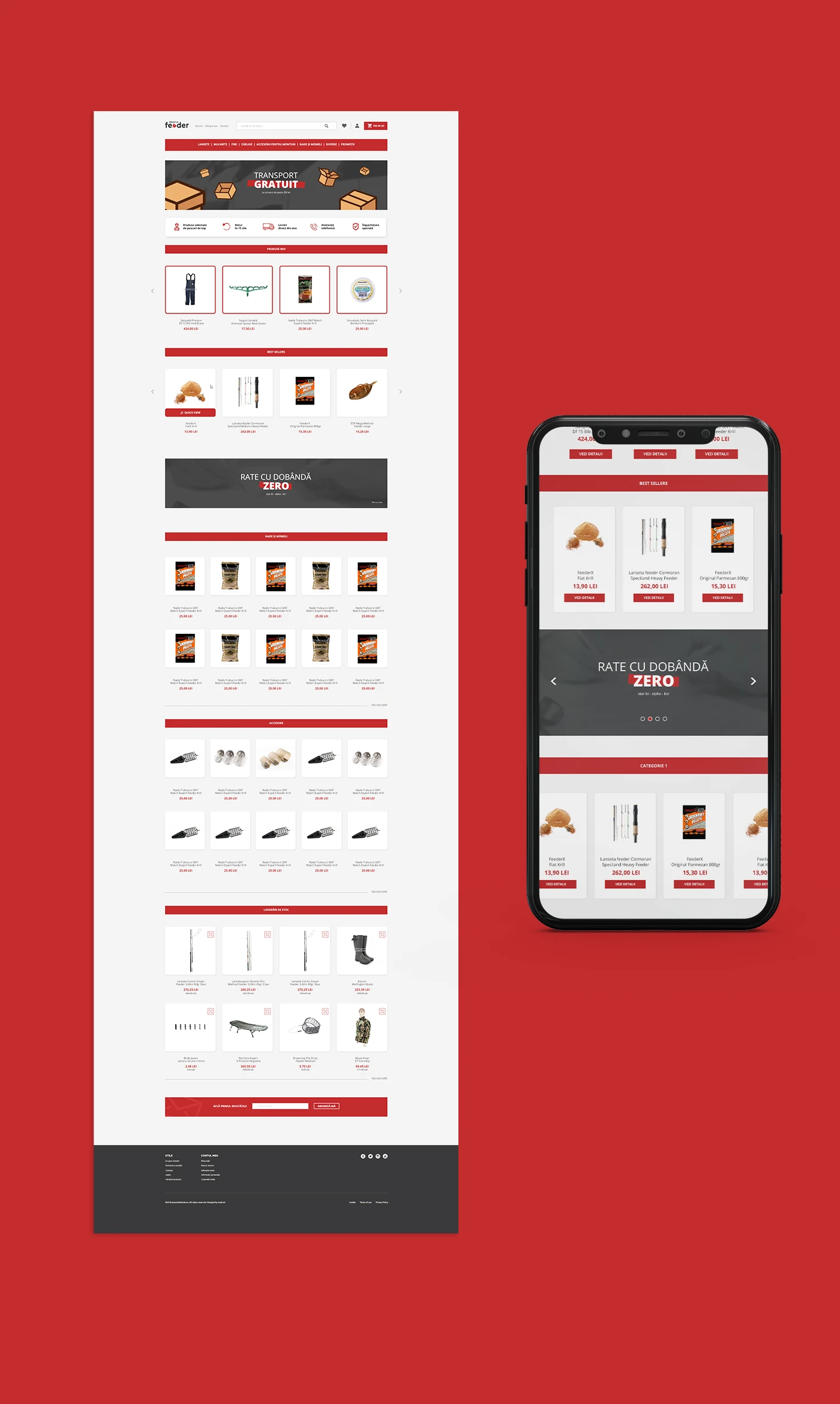
Online-store layouts
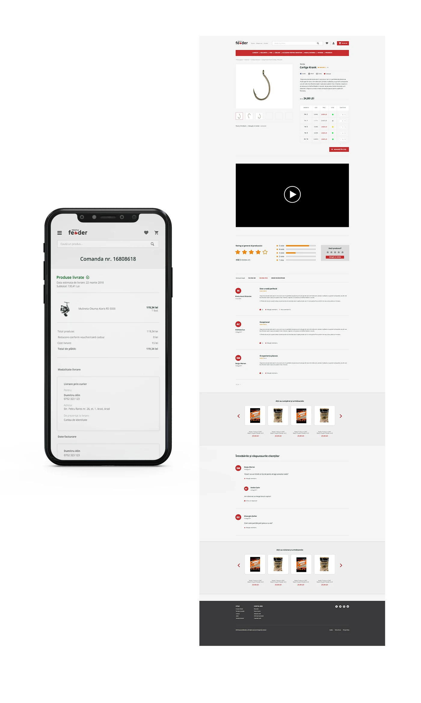
Desktop and mobile layouts show the product catalogue and product-detail pages. The designs carry the red accent into navigation, product information and purchase controls.
Product promotions
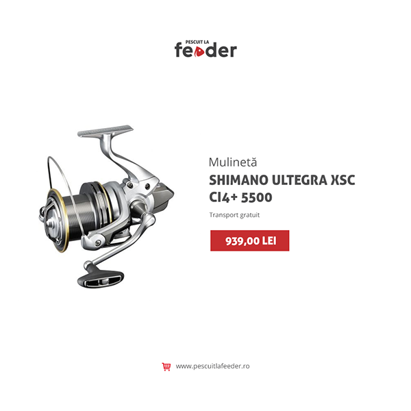
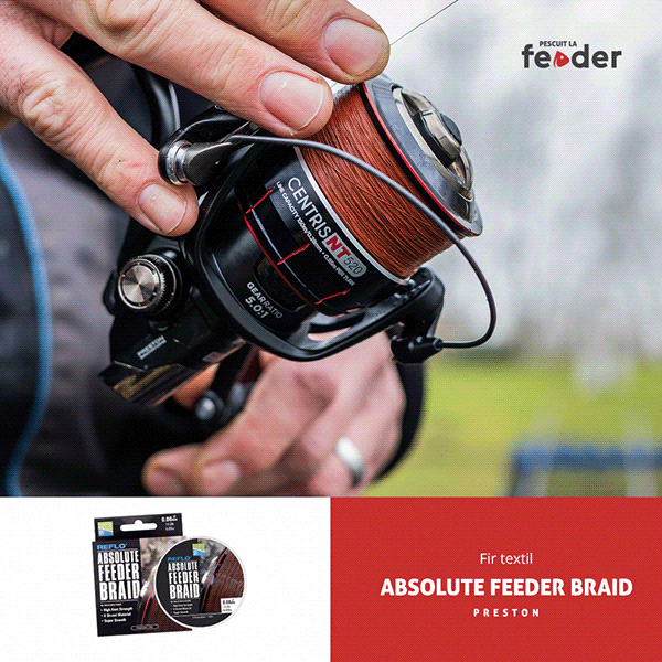
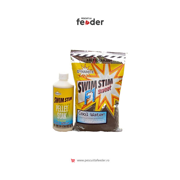
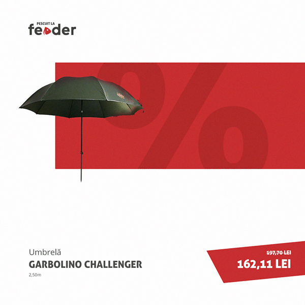
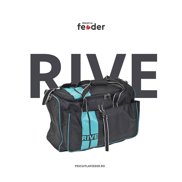
A set of promotional layouts combines product photography, prices and short messages. The same palette supports both information-led graphics and larger product imagery.



Curent Grup
Start a project
Let’s talk.
A few details are enough to start: your business, what you need designed and your timing.