
Curent Grup
Rebranding
2016
A familiar logo,
a clearer visual identity.
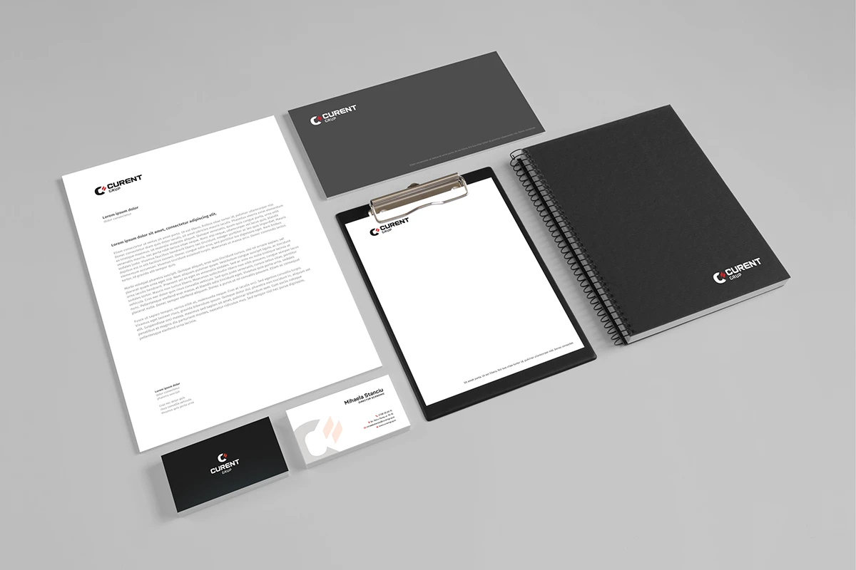
A refined logo and visual identity for Curent Grup, carried across stationery, business cards and social media graphics.
- Project
- Logo refinement & visual identity
- Year
- 2016
- Scope
- Logo refinement, visual identity, stationery & social media graphics
Project context
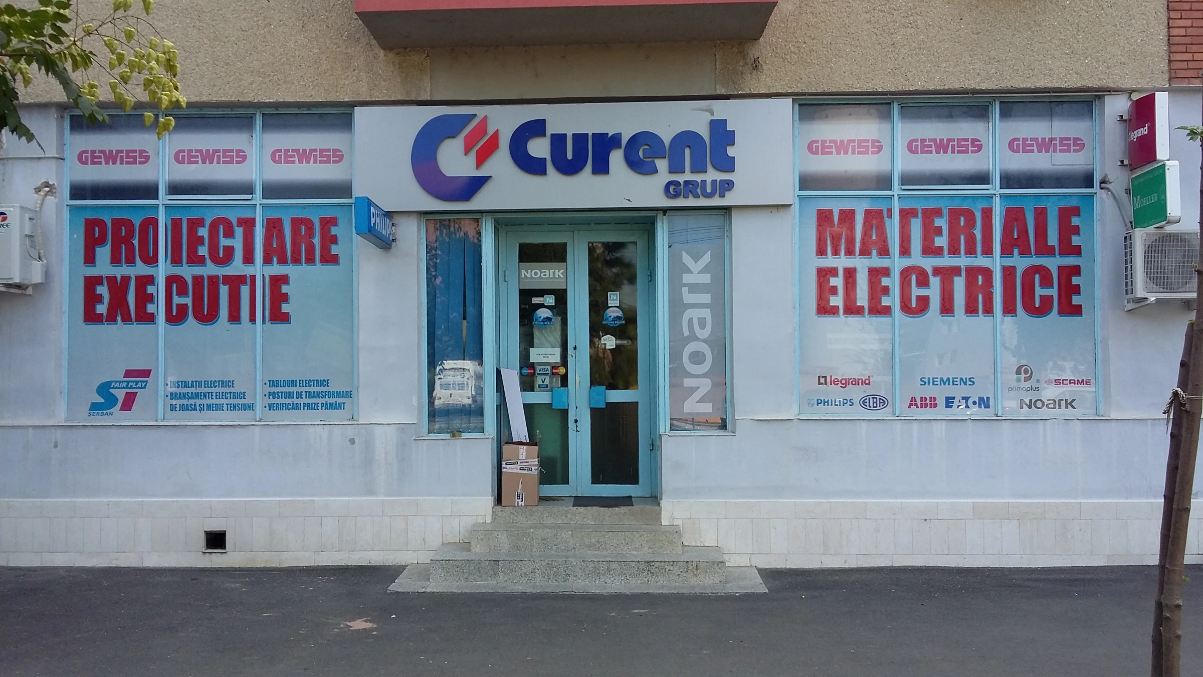
Founded in 2002, Curent Grup had been present in the local electrical equipment market for years before this 2016 project. The work was a touch-up of its existing logo and the establishment of a coherent visual identity, preserving recognition while creating consistent applications across print and social media.
The refined identity
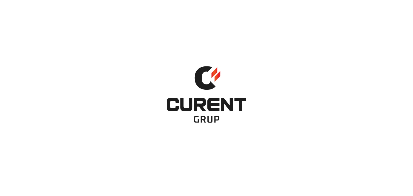
The existing C symbol and paired red shapes remain the recognisable starting point. The touch-up refines the mark and establishes consistent typography, colour and layouts around a logo already familiar in the local market.
Print applications
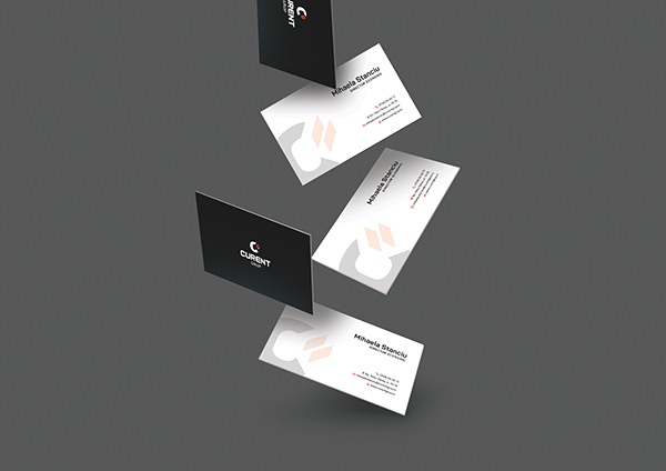
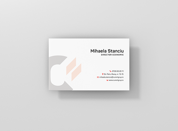
Business cards combine the black-and-red mark with a pale, enlarged version of the symbol. The stationery set at the start of the project extends the same identity across documents and printed materials.
PolyFarm
Start a project
Let’s talk.
A few details are enough to start: your business, what you need designed and your timing.
Social media graphics
Product posts, seasonal greetings and visual wordplay introduce the store’s electrical equipment through different campaign images, with the Curent Grup logo tying the posts together.