
Fair Play Șerban
Rebranding
2017
A refreshed identity
for an electrical company.
A visual identity update for Fair Play Șerban, with a new symbol, typography and applications across print, vehicle graphics and signage.
- Project
- Visual rebranding
- Year
- 2017
- Scope
- Logo redesign, colour & typography, print & signage presentations
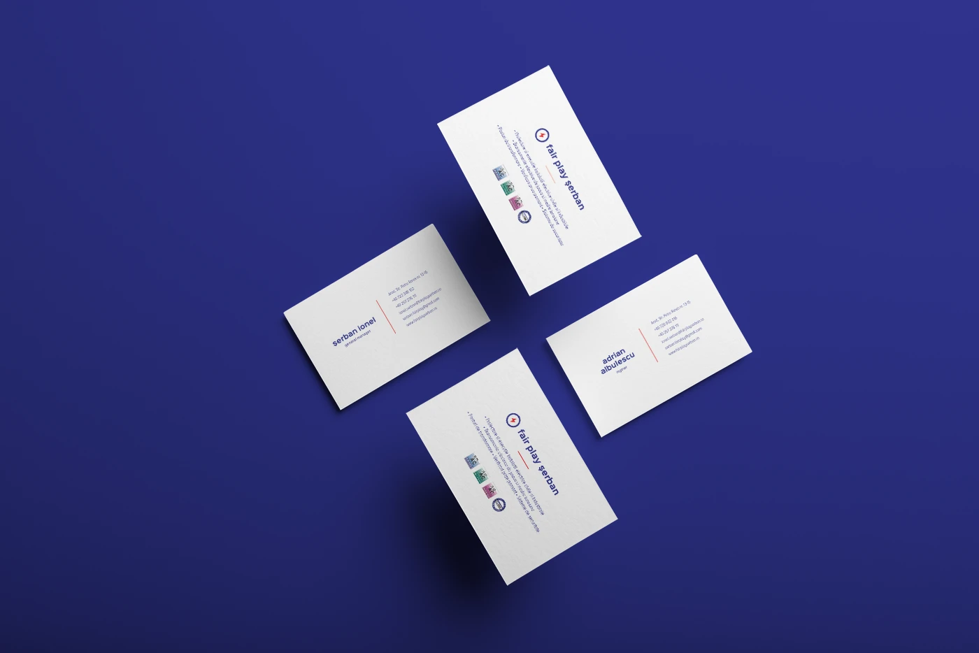
Project context
Fair Play Șerban is an electrical installation company founded in 1993. Its previous logo looked dated and did not clearly communicate the field of activity. The redesign gives the name a visual connection to electrical work while retaining the red-and-blue palette.
The redesign
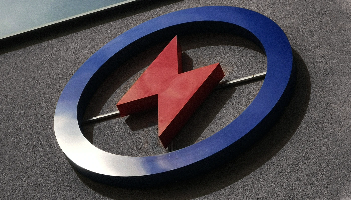
The subtlety lies in merging a play button with a lightning bolt, connecting the company name with its electrical work. The circle was chosen as a perfect geometric form, a secondary nod to the word fair.
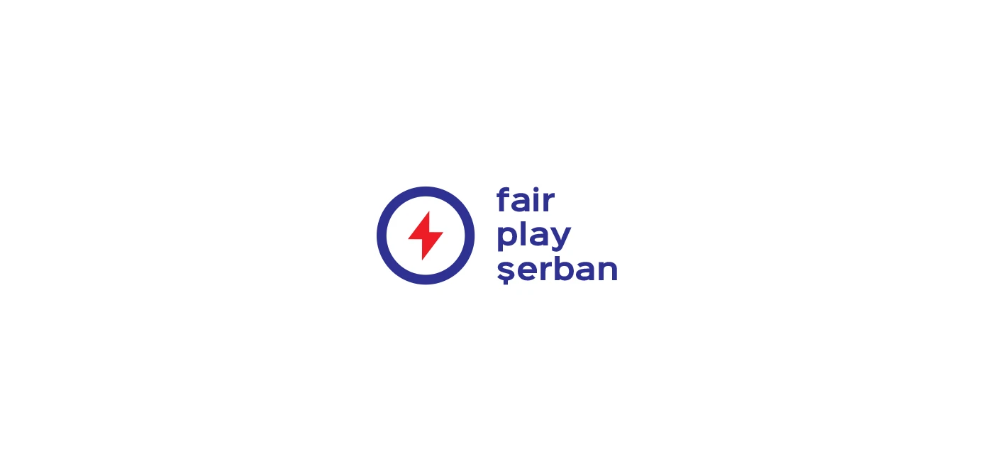

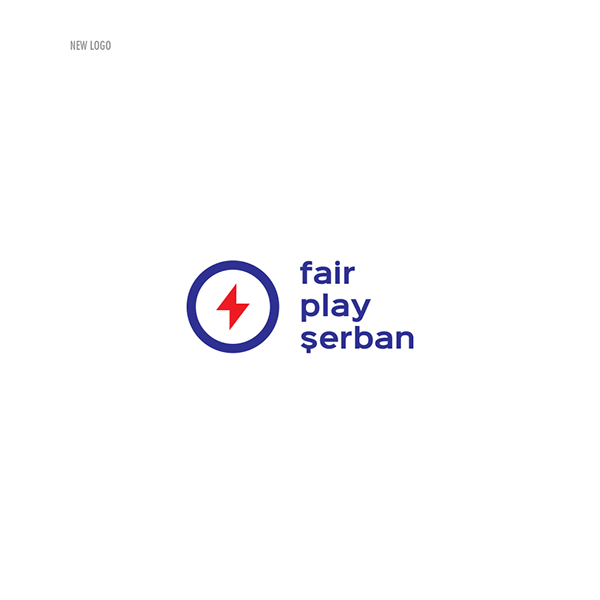
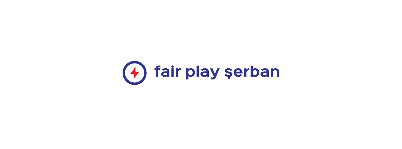


The compact and horizontal versions keep the same symbol while rearranging the company name. This allows the identity to fit different proportions across business cards, vehicle graphics and signage.
Colour and typography
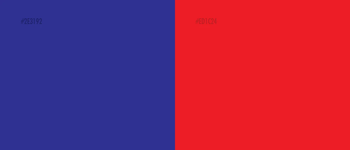
Blue and red define the palette, with Sinkin Sans used for the typography.

Print, vehicles and signage
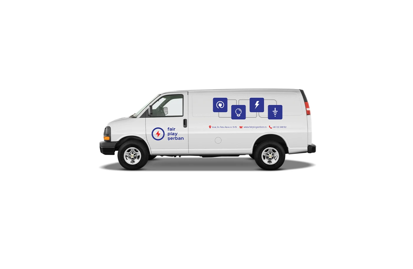
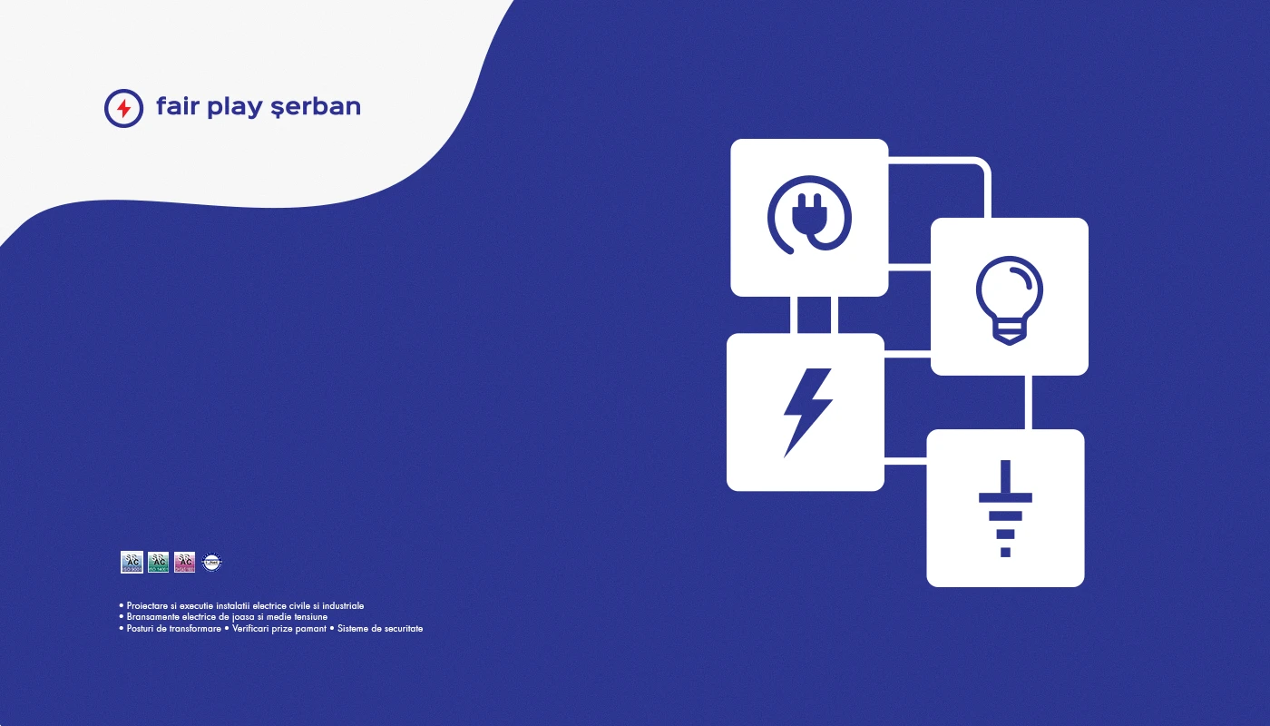
Business cards, vehicle graphics and a dimensional-sign presentation show how the identity can extend beyond the logo. The print layouts also introduce electrical-service icons.
Men’s Crown
Start a project
Let’s talk.
A few details are enough to start: your business, what you need designed and your timing.